Kenneth Cole Store Locator
-
Kenneth Cole had been growing their international audience with new stores around the globe and needed an easy and attractive way for its customers to find a store in their location.
-
The creative ask for a project like this is not to reinvent the broken wheel. For example, the KC dev team had been trying to jam a lot of explicit content into a layout that could not contain that amount of information. Instead, we took a staged approach that found an area within the framework that we could expand into a new UX area within the site while keeping the familiar experience and interface. Exploiting limitations like this becomes key to the success of the project. Working with the product, dev, marketing, and procurement teams, we designed a UX interface that could complement their layout and work within their programming logic.

Sitemap that shows UX options between NA and International customers on the Kenneth Cole website.

Sitemap showing clickstream for International customers trying to find a store.

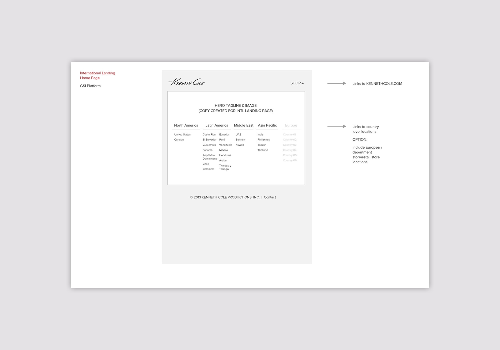
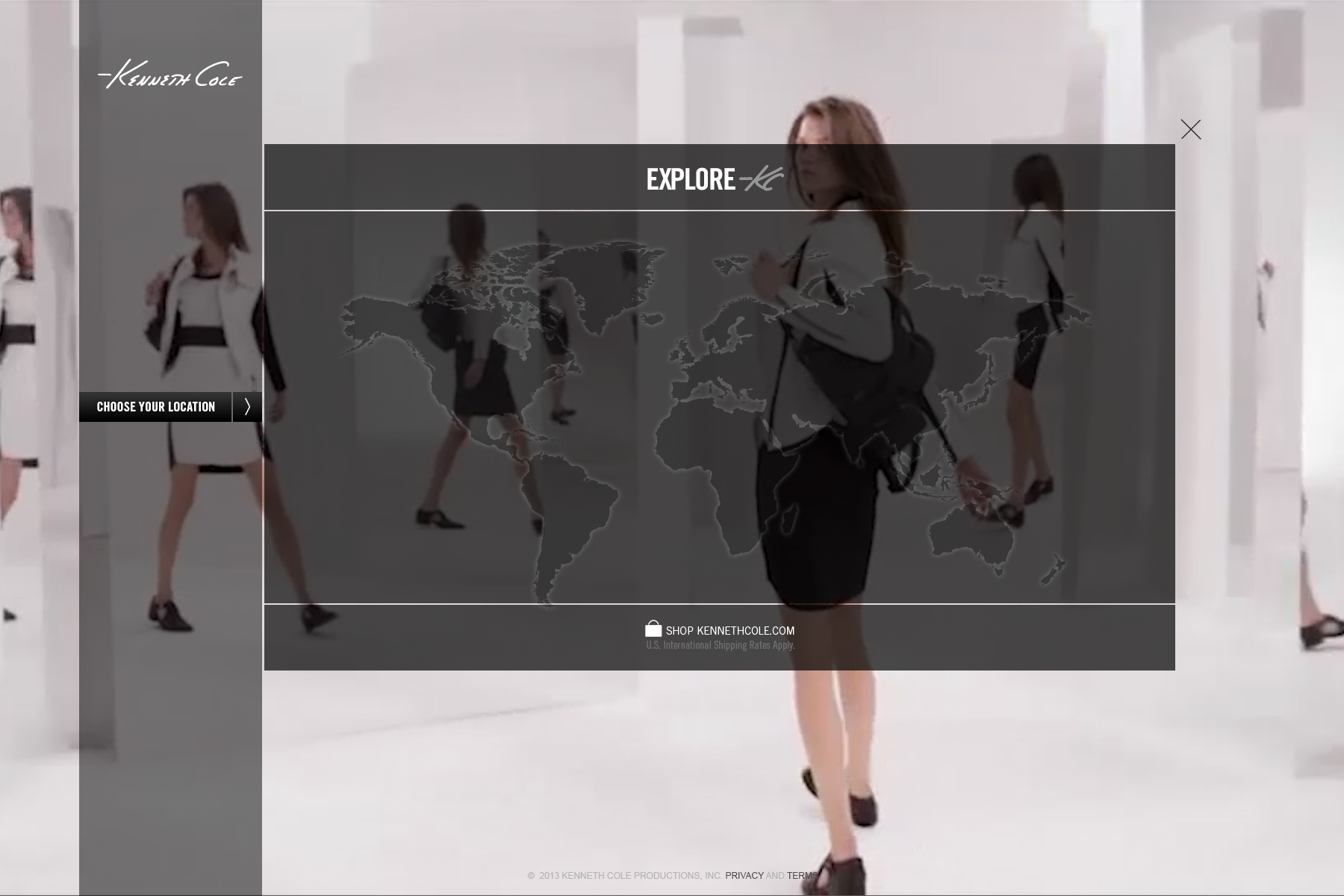
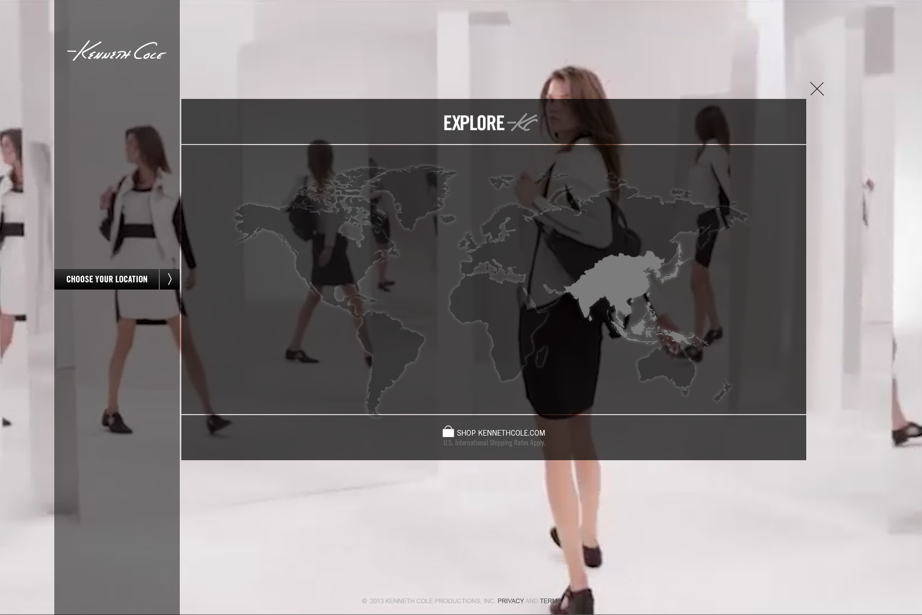
UX design for country selector.

UX placement for find a store feature.

Search results listing for store locator.
Get to know the team.
When a project takes a long time and many different stakeholders are involved, it’s always a good idea to get to know the entire team. Not just your immediate clients and project resources, but try to get to know the execs, the HR, the IT team – everyone. A project like this covers a big chunk of time, spans international boundaries, and has many different players involved at different levels – in an industry that moves fast and has rigorous marketing demands – forced us to get to know the entire team. The trouble was the team kept changing. By the end of the project, the people at the last review meeting were entirely different from those at the kick-off meeting. Lesson learned: Outline your UX strategy and publish it so everyone can be on the same playbook from beginning to end, no matter who comes and goes – you don’t want to update your strategy every time a new prevailing wind blows in.


