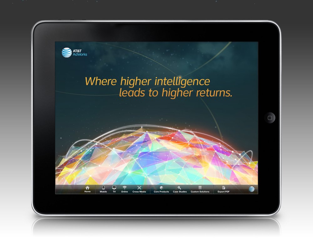
AT&T Ad Network App UX & Design
-
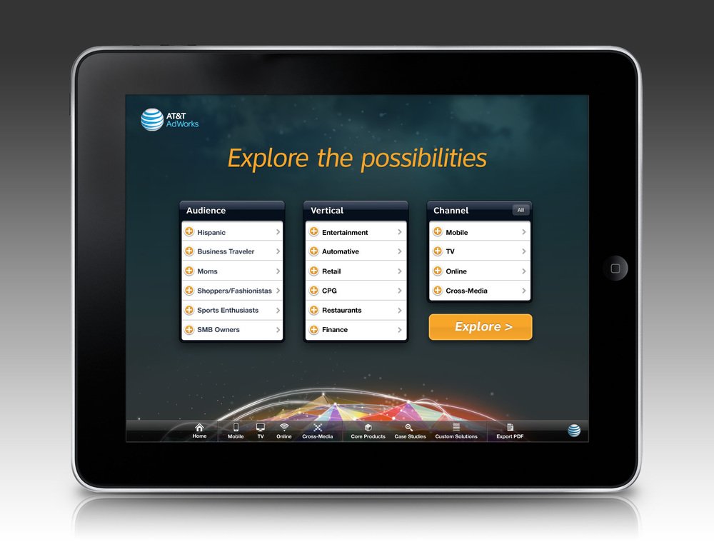
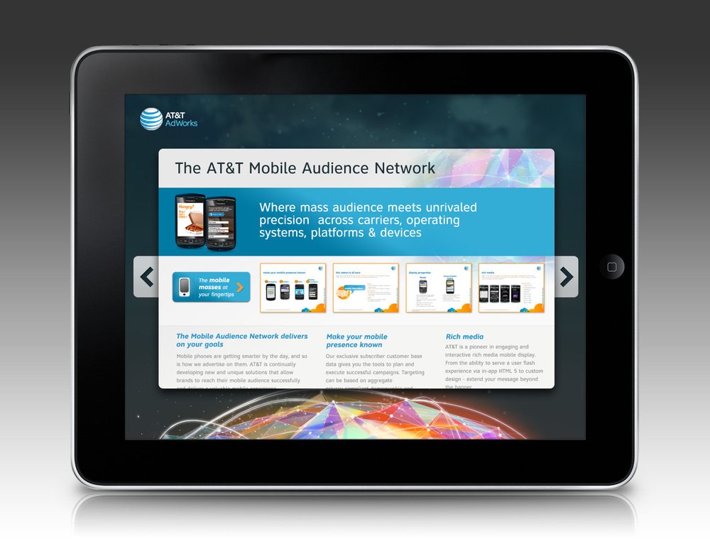
A colleague mentioned that his client, AT&T needed to develop an app for the sales team of their ad network. The goal was for them to be able to model what a campaign would look like and sell digital inventory on the fly. So we sat down and designed an app that the AT&T sales team could use to put together campaigns in real-time grabbing metrics like industry verticals and demos.
-
The project kicked off with a strategy sprint where we had several sessions with stakeholders, the sales team, and executives to define the goals for the app. After the sessions, we created a brief detailing the content, functional, and programming needs.
-
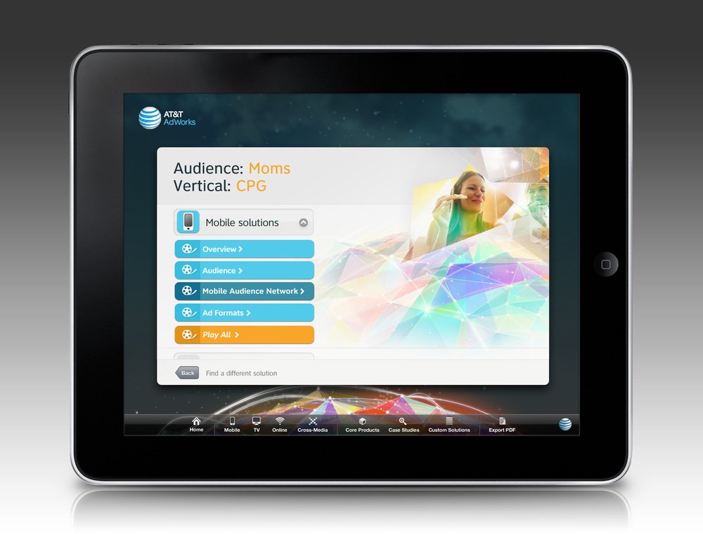
We knew that we would not be programming the app ourselves, but we needed to get buy-in from the AT&T team, so we created a functional prototype that walked through the various scenarios. AT&T has a user base of about 92 million people. That's an extensive data set to segment for ad delivery. So I designed the app to allow the sales team to log in, generate campaigns based on the segments and show their clients KPIs (based on look-a-like campaigns).
Campaign Website Design
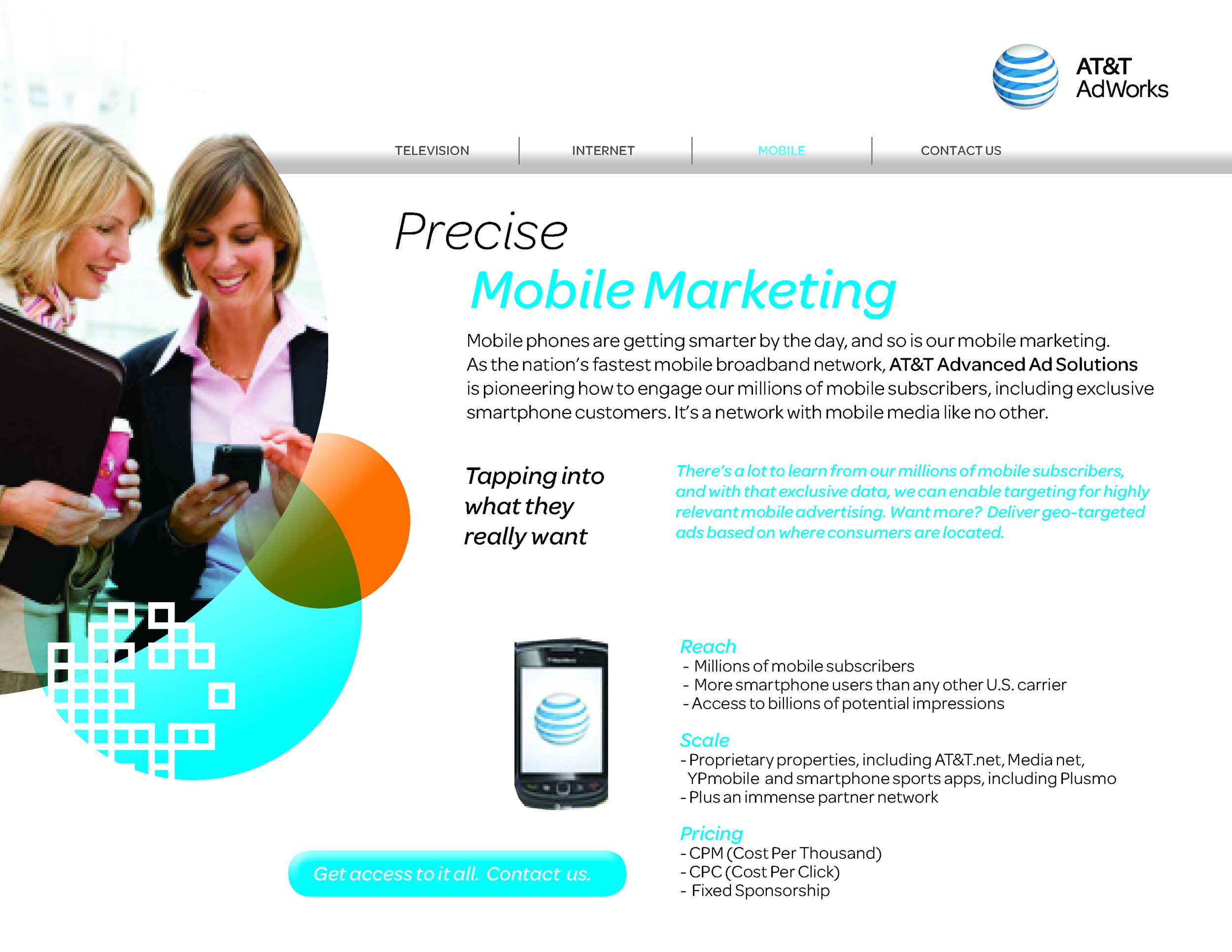
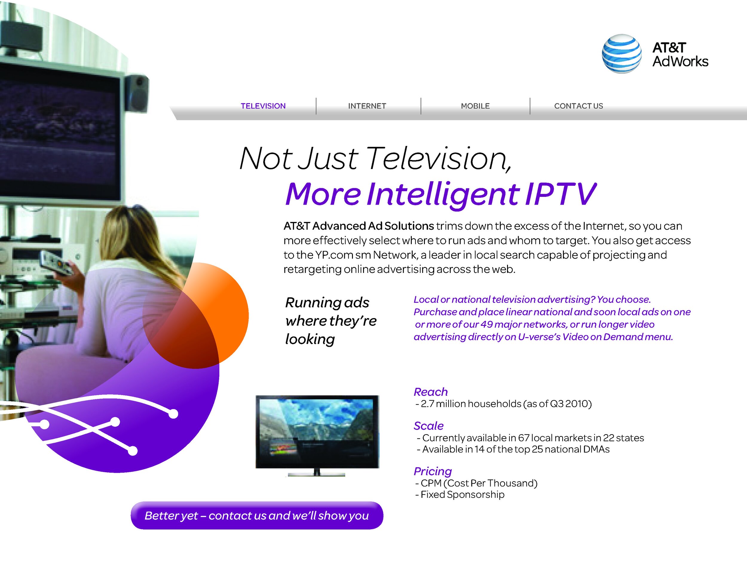
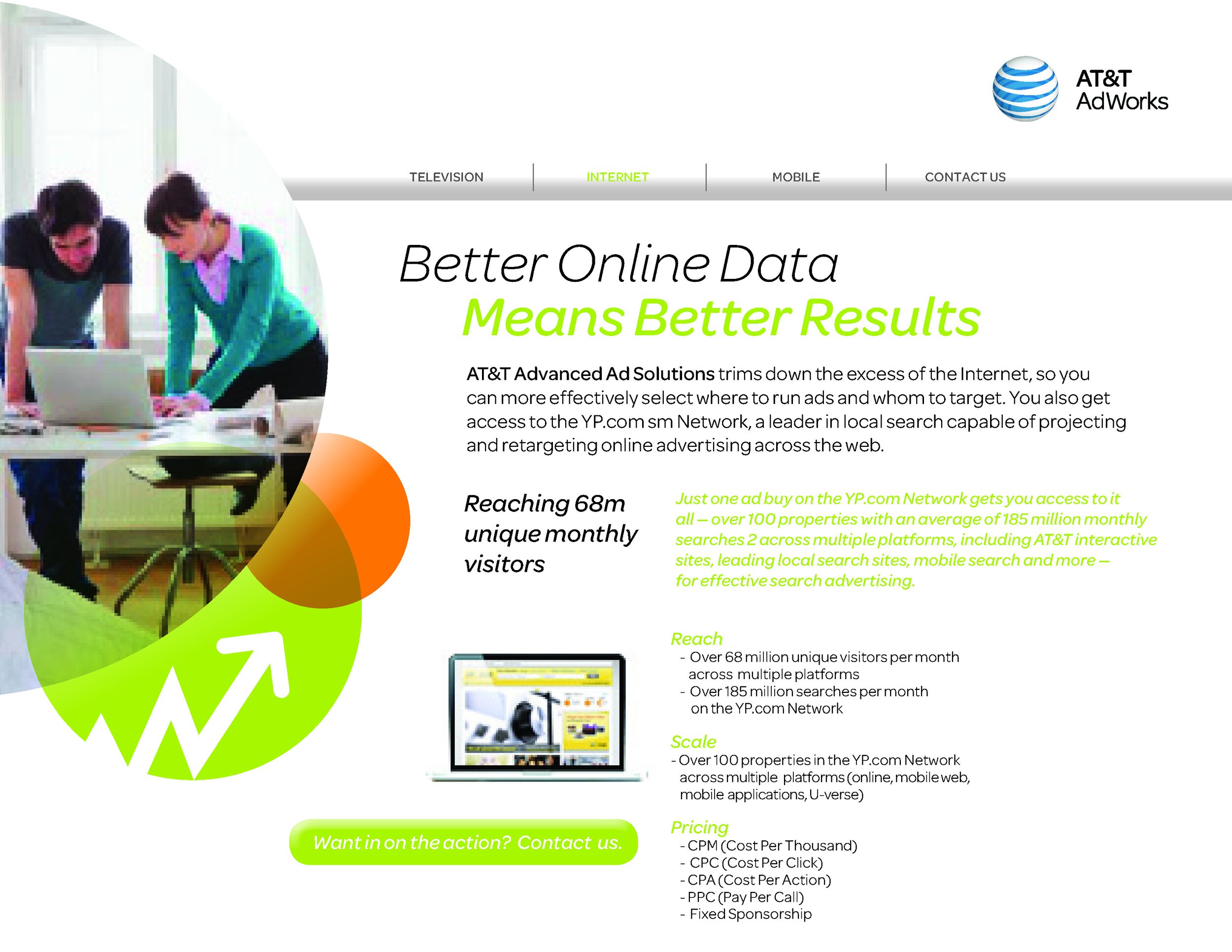
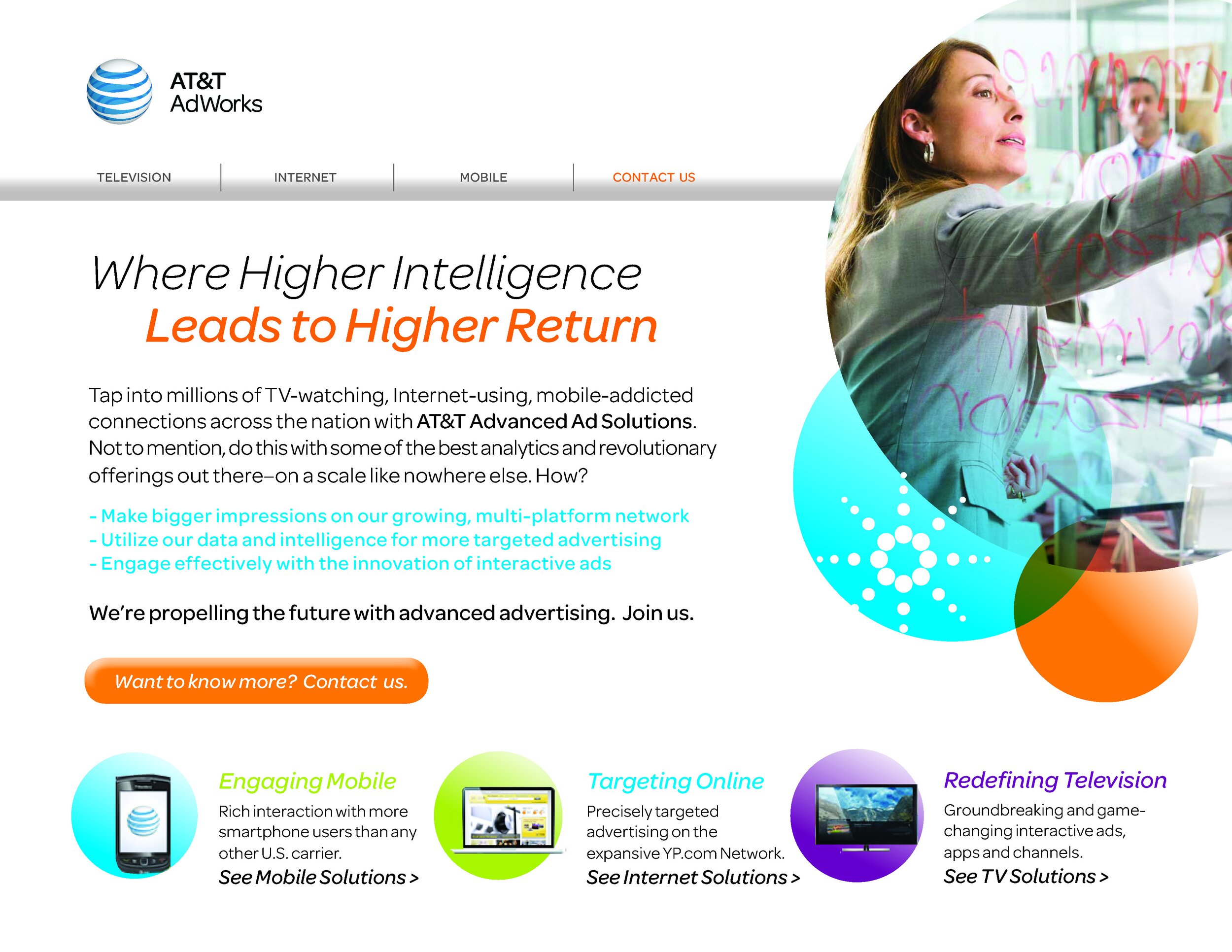
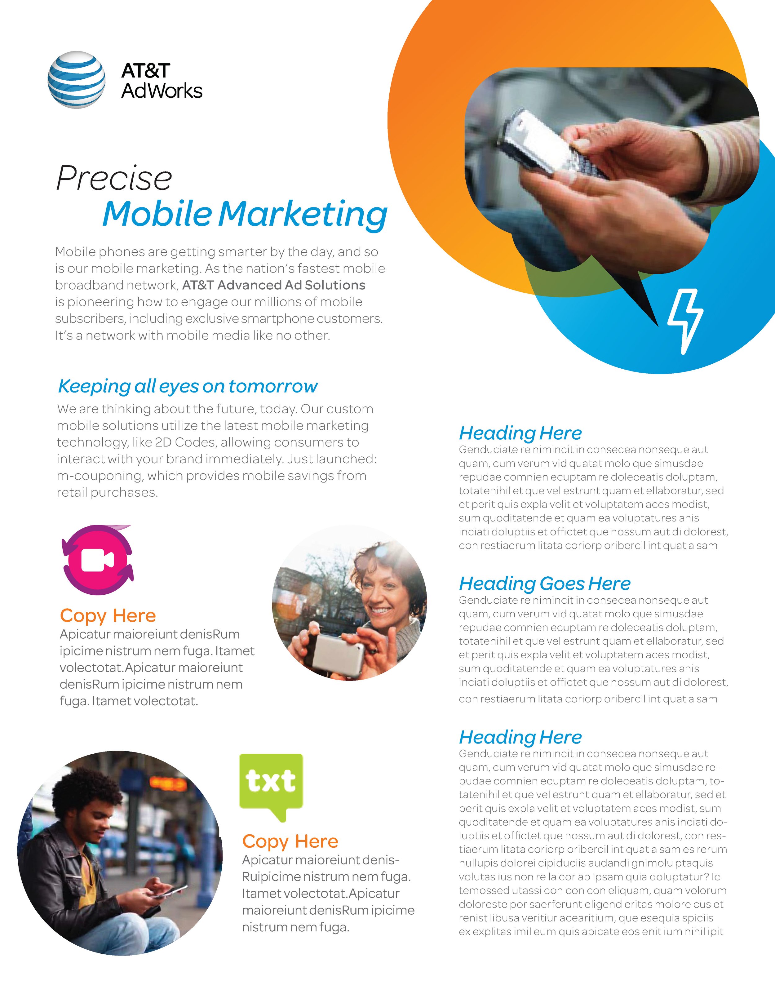
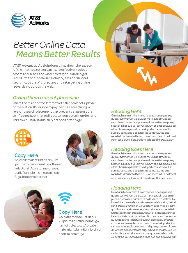
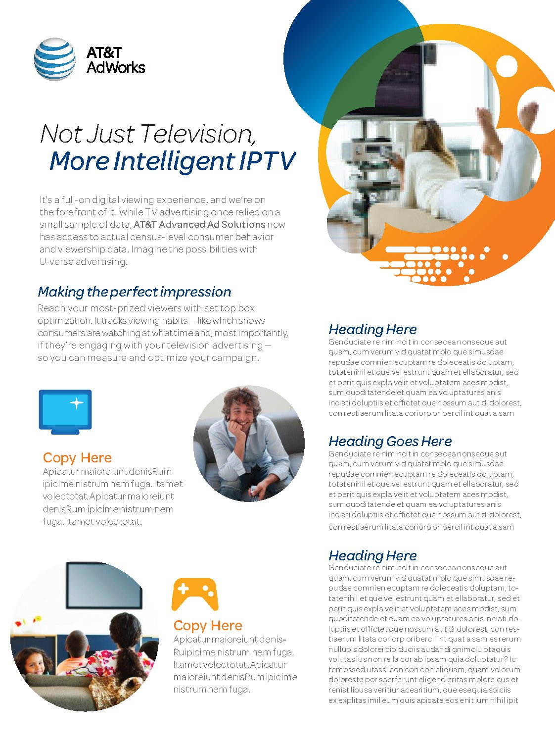
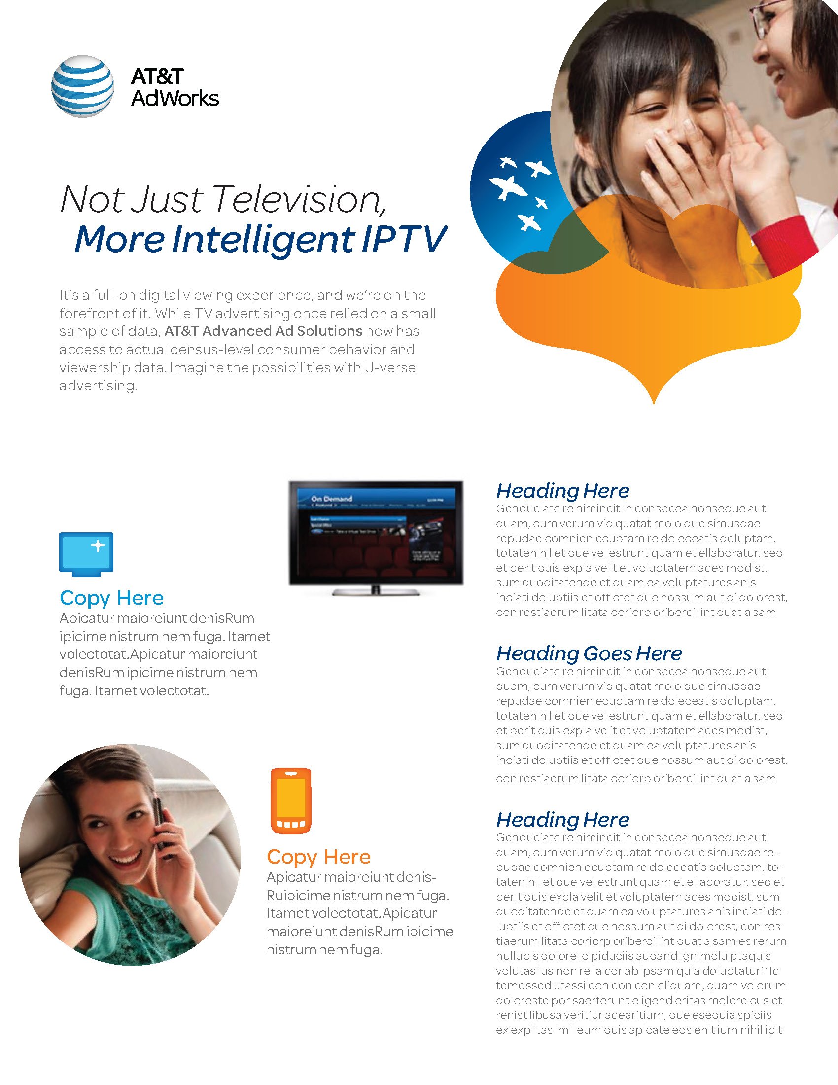
Sales Marketing Collateral Design
92 Million strong.
The digital media sales team at AT&T wanted to show clients in the field what their ad campaigns could look like based on a selection of criteria like demos, audience, verticals, etc. So I worked with a digital media agency to help strategize the user experience and then design the first iteration of the application. The most interesting (and challenging) thing is the combination effects when you pool a sample set of 92 million users (the AT&T subscriber base AT&T the time).
